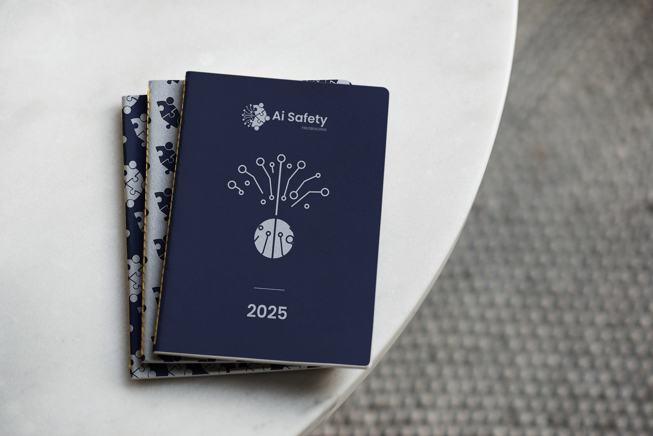
Visual identity for the AI Safety Fieldbuilding organisation.
ABOUT THE PROJECT
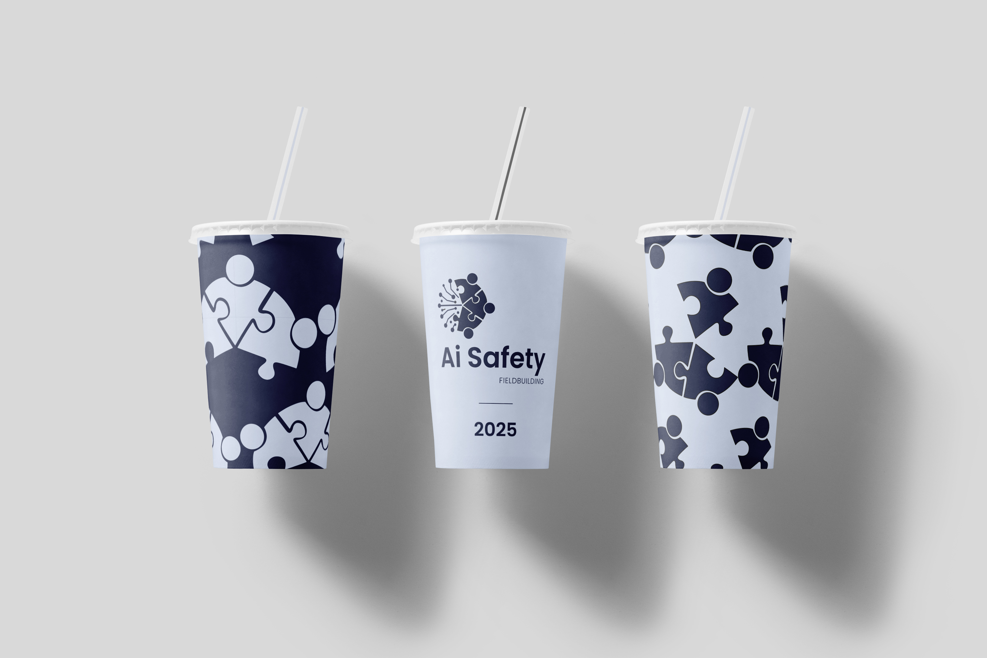
The project was created for a non-profit organization: AI Safety Fieldbuilding. As part of the visual identity work, I designed a logo, usage examples, and patterns related to the logo symbol.
The symbol draws inspiration from visual representations of AI neural networks and the idea of teamwork — a core value of AI Safety Fieldbuilding.
BACKGROUND
AI Safety Fieldbuilding is a non-profit organization dedicated to promoting AI Safety, with a focus on students of the University of Warsaw, particularly those studying mathematics and computer science. As part of its activities, AI Safety Fieldbuilding organizes hackathons, meetups, and lectures dedicated to the concept of AI Safety. The main aim of the project is to raise awareness of the topic of AI Safety among young, ambitious people.
THE PROJECT IDEA
The inspirations for the sign were images of neural networks and the concept of team cooperation. The graphical representation of neural networks is arguably the most popular visual depiction of AI. Team cooperation, in turn, reflects the most important goal of the Ai Safety Fieldbuilding organisation (lub: our organisation, Ai Safety Fieldbuilding).
I decided to integrate these two themes/elements within a single circular design/form. To visually represent team cooperation, I chose a puzzle motif for a better visual result.
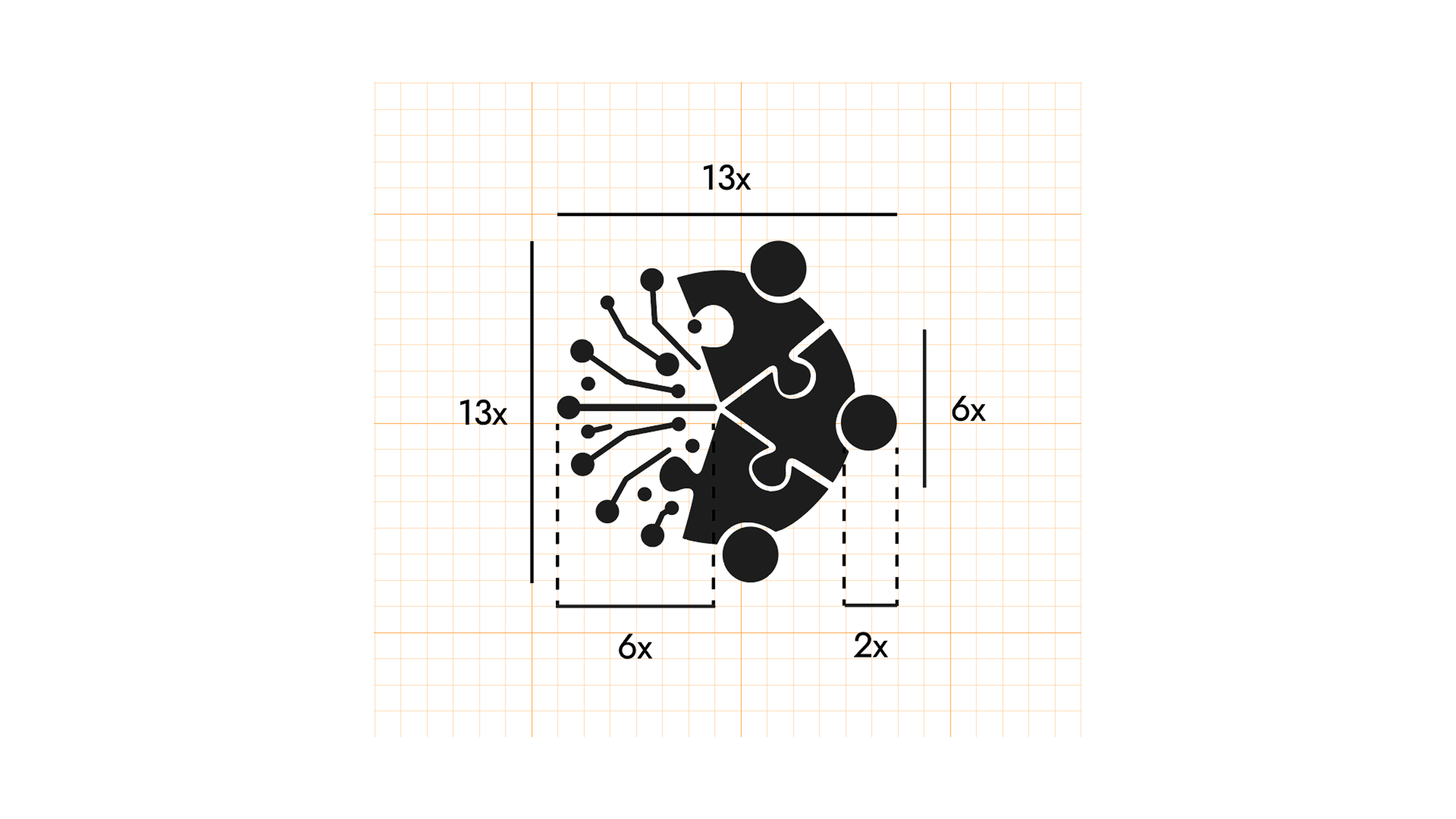
The relationships between the logo elements determine a grid. The construction module is a square with a side length of 1/13 of the sign’s height. The width of the sign is 40x, whereas the widths of the symbol and the logotype are as follows: 13x and 25x.
To define the logo's safe area, I used a height of the logotype (6 squares).
The symbol consists of two main elements, each occupying half of the total area. Its proportions and size are defined by the following construction grid. The symbol alone may be used in situations where a square format is required. A single grid module is a square with a side length equal to 1/13 of the symbol’s height.
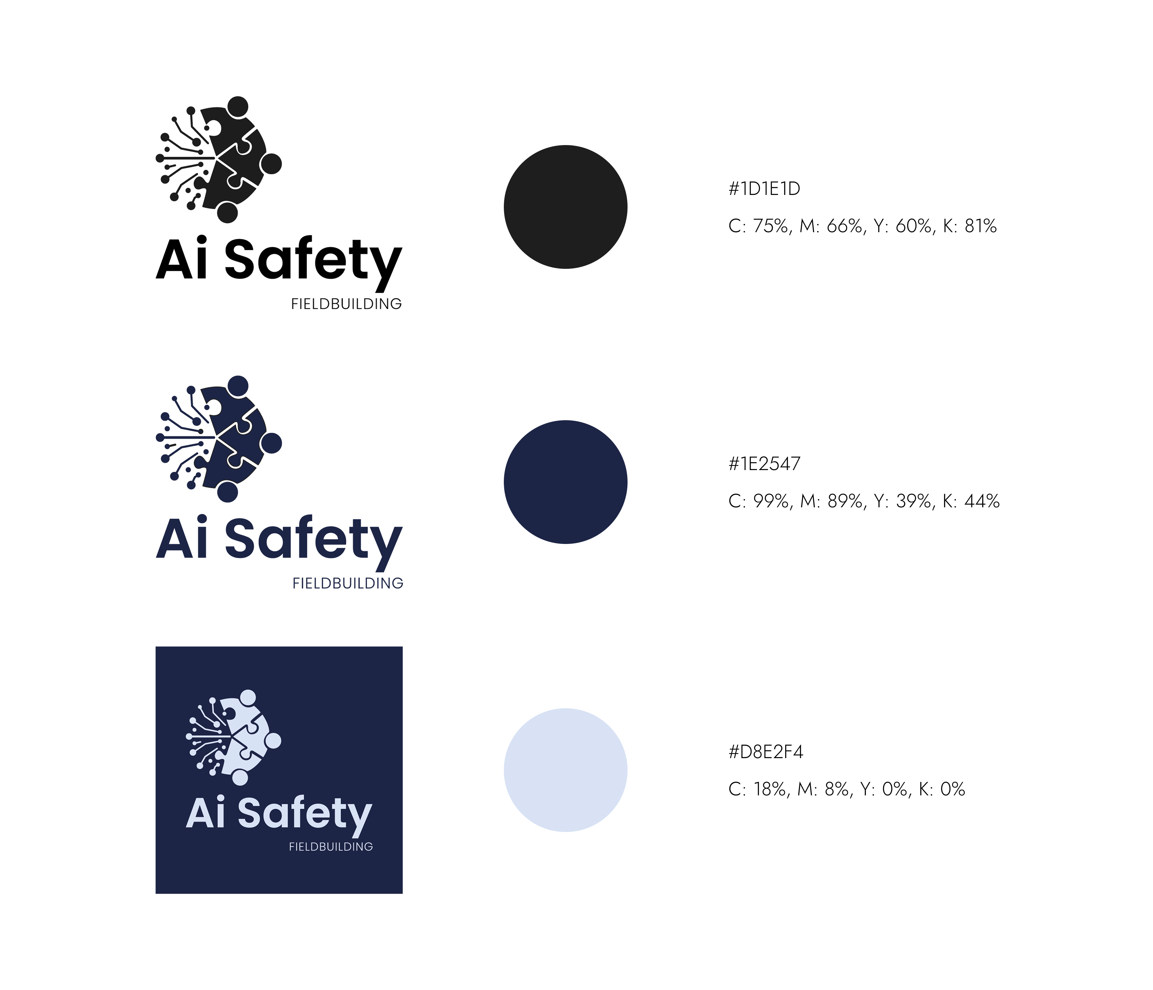
The proposed new logo consists of a symbol and a logotype. For the logotype, I chose the Poppins font in two weights: Semibold for the "AI Safety" part, and Light for "FIELDBUILDING." With its simple, modern, and clear character, the logotype complements the symbol and aligns with the mission of the AI Safety Fieldbuilding organization.
To ensure the logo's responsiveness across various formats, I created both vertical and horizontal versions.
I created three color versions of the logo: black, dark blue, and bright blue on a dark blue background.