ABOUT THE PROJECT
The project is a proposal for a new visual identity for the Fundacja Aktywizacja organization. It was created as part of a new logo design competition.
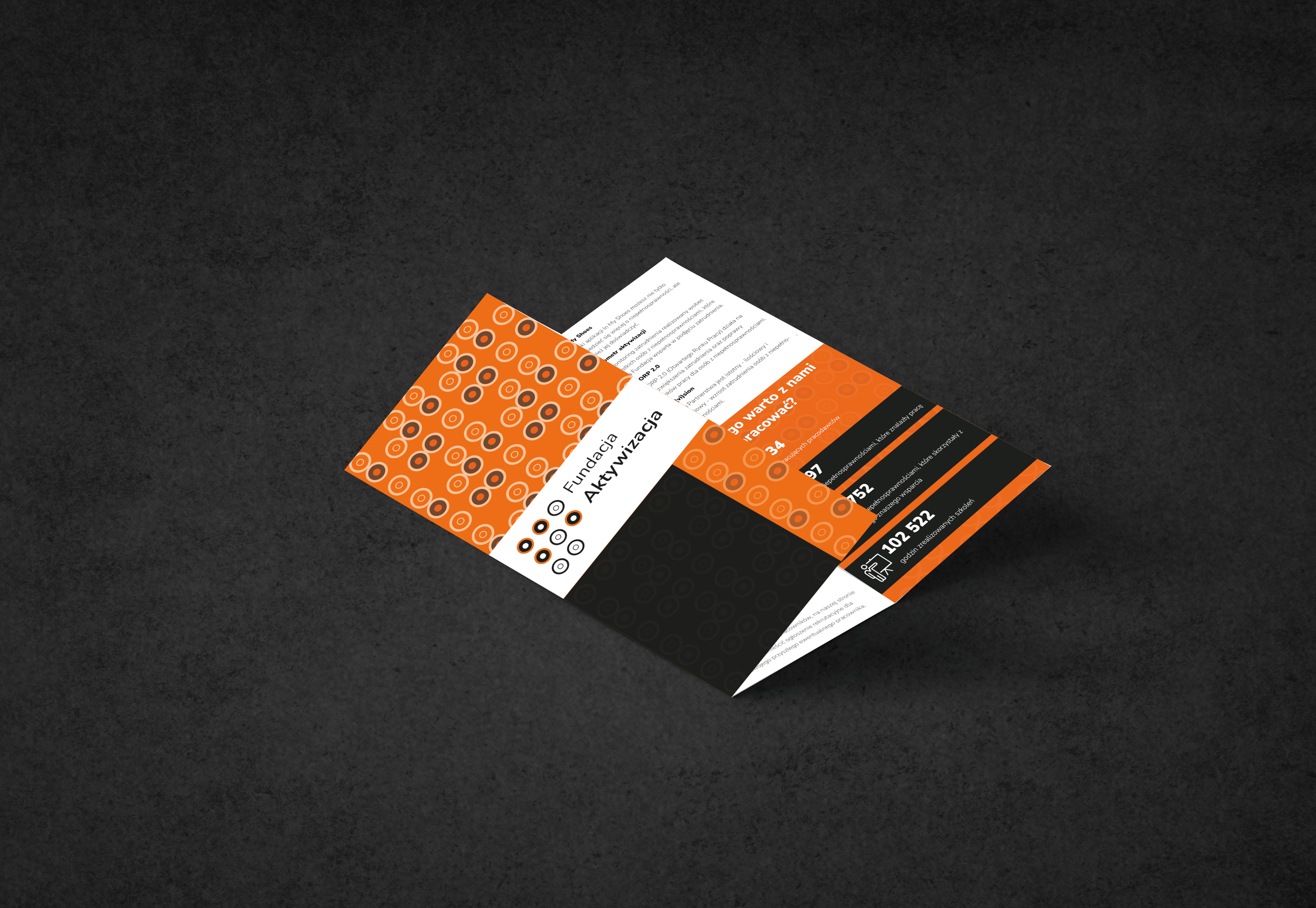
The presented project includes the project idea, the design structure of the logo, methods of use, colors, and examples of complete products featuring the visual identity.
BACKGROUND
Fundacja Aktywizacja is an organization that helps people with different types of disabilities find satisfying jobs and develop their careers. It also offers courses and cooperates with a wide range of employers.
THE PROJECT IDEA
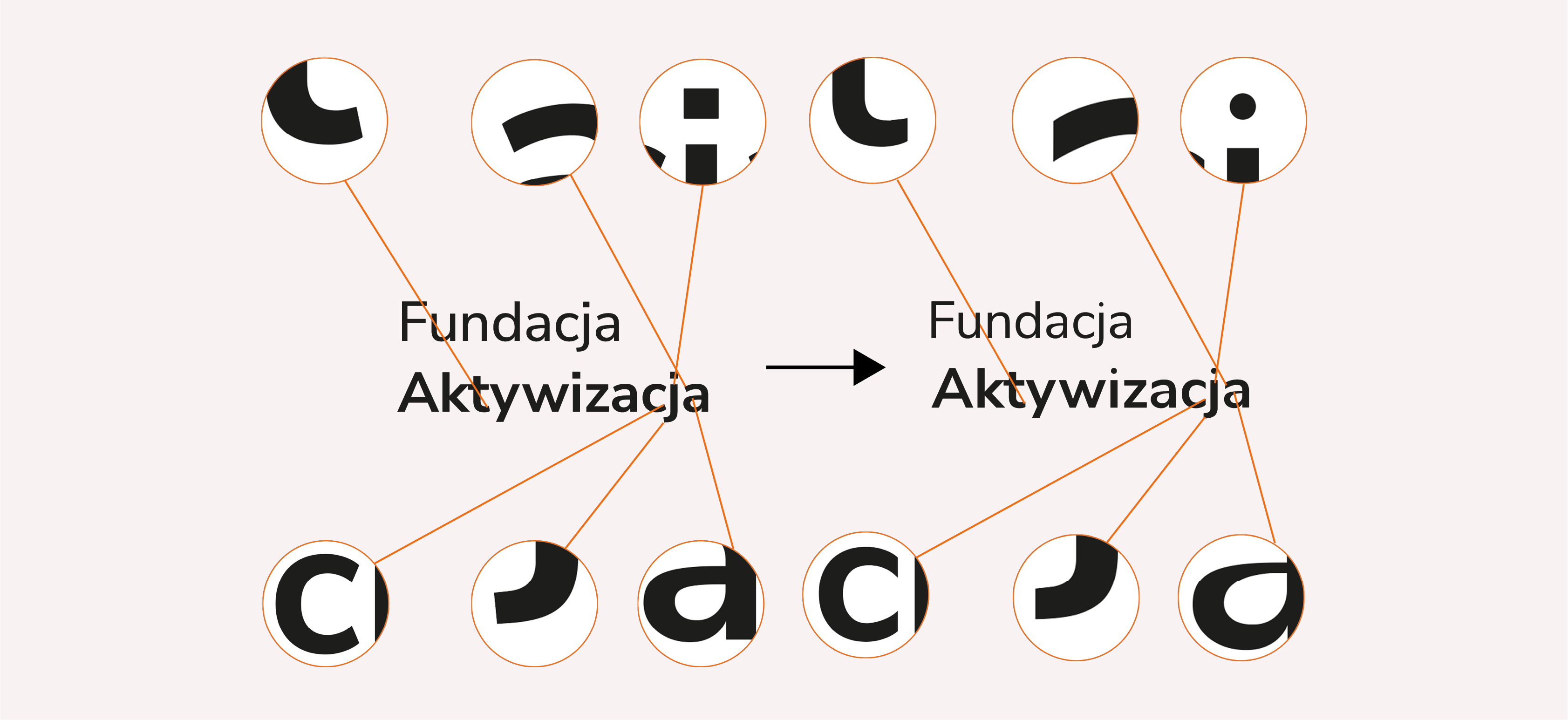
The proposed new logo includes a symbol and a logotype. The symbol refers to the Braille alphabet (a combination of the letters A and F, which are also the foundation's initials) and to AA batteries (cylindrical) viewed from above. The batteries symbolize energy, dynamism, and activity. In addition, the abstract, circular form of the symbol’s elements refers to a basic sign of disability.
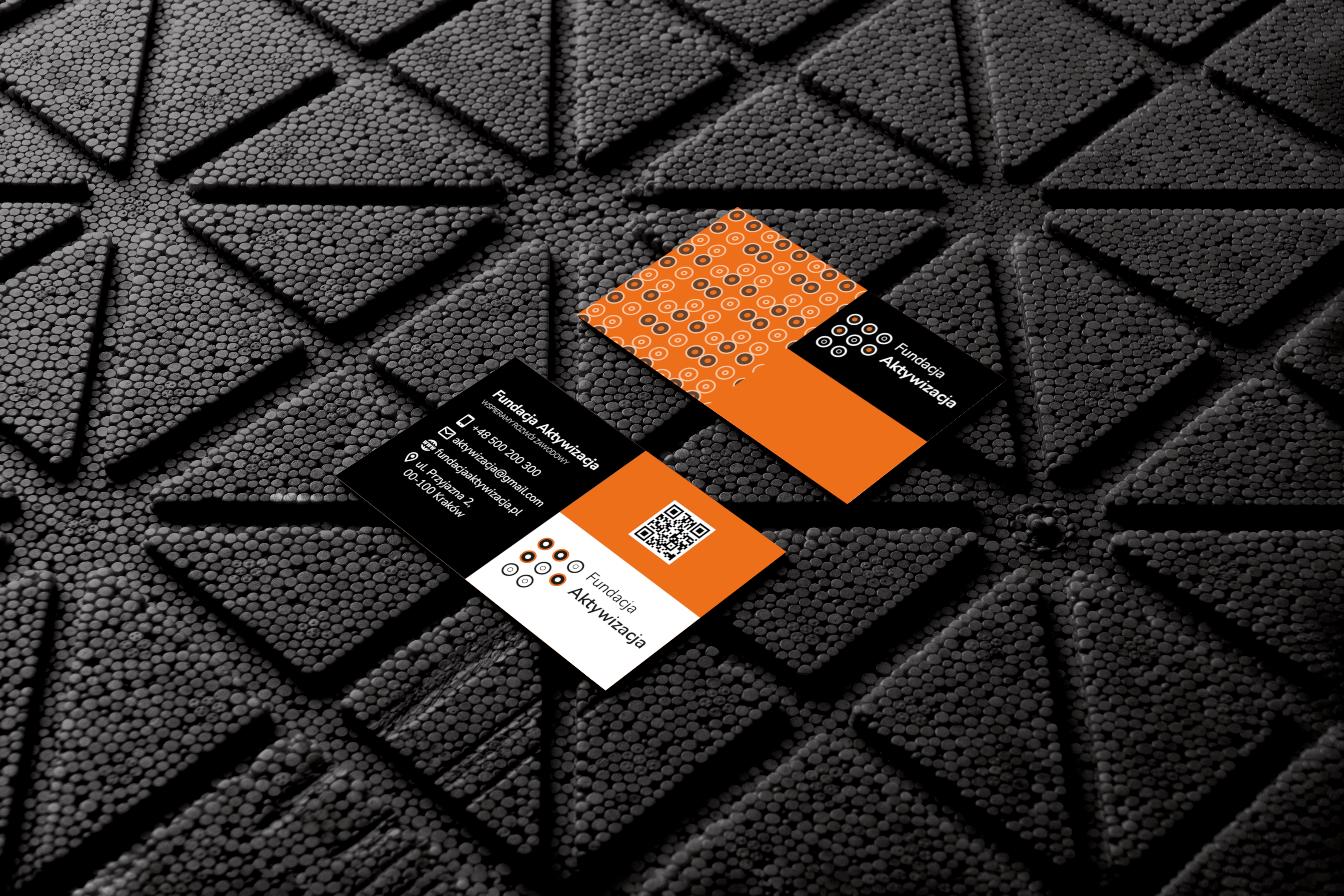
The sign, in its basic version on a white background, is presented in black with an orange accent. The proposed color palette gives the logo a modern look and emphasizes its minimalist character.
The relationships between the logo elements determine a grid. The construction module is a square with a side length of 1/11 of the sign’s height. The width of the sign is 32x, whereas the widths of the symbol and the logotype are as follows: 11x and 19x. The height and width of a single element of the symbol are 3x.
To define the logo's safe area, I used a single element of the symbol, which is equal to 3 squares of the module grid.
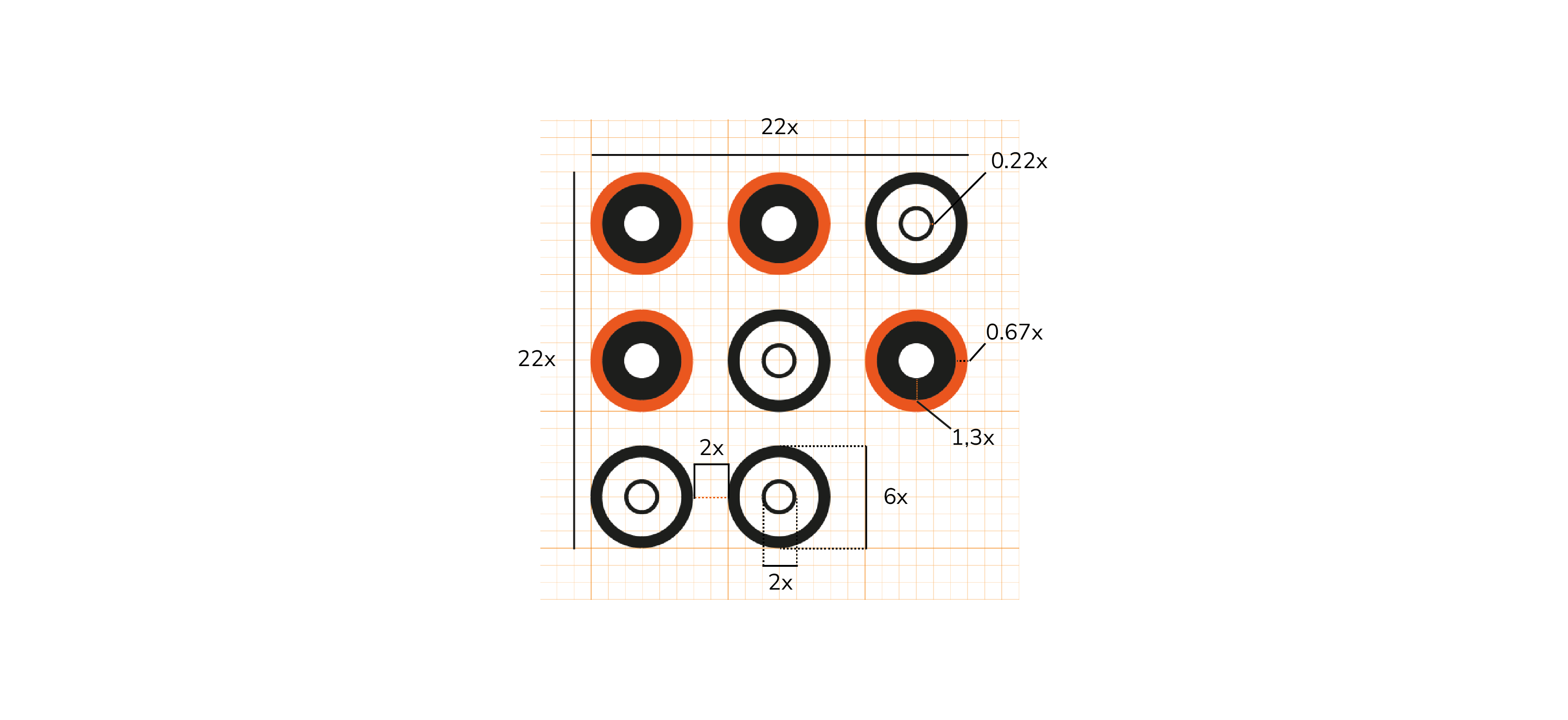
The symbol includes 8 elements. Its proportions and size are defined by the following construction grid. Using only the symbol is possible in cases where a square sign is required. A single module of the grid is a square with a side length of 1/22 of the symbol’s height.
The proposed new logo includes a symbol and a logotype. The symbol refers to the Braille alphabet (a combination of the letters A and F, which are also the foundation's initials) and to AA batteries (cylindrical) viewed from above. The batteries symbolize energy, dynamism, and activity. In addition, the abstract, circular form of the symbol’s elements refers to a basic sign of disability.
The basic colors of the logo are based on two shades: off-black and orange.