Logo design project for the Neurological Speech Therapy Office "Moc Słów".
ABOUT THE PROJECT
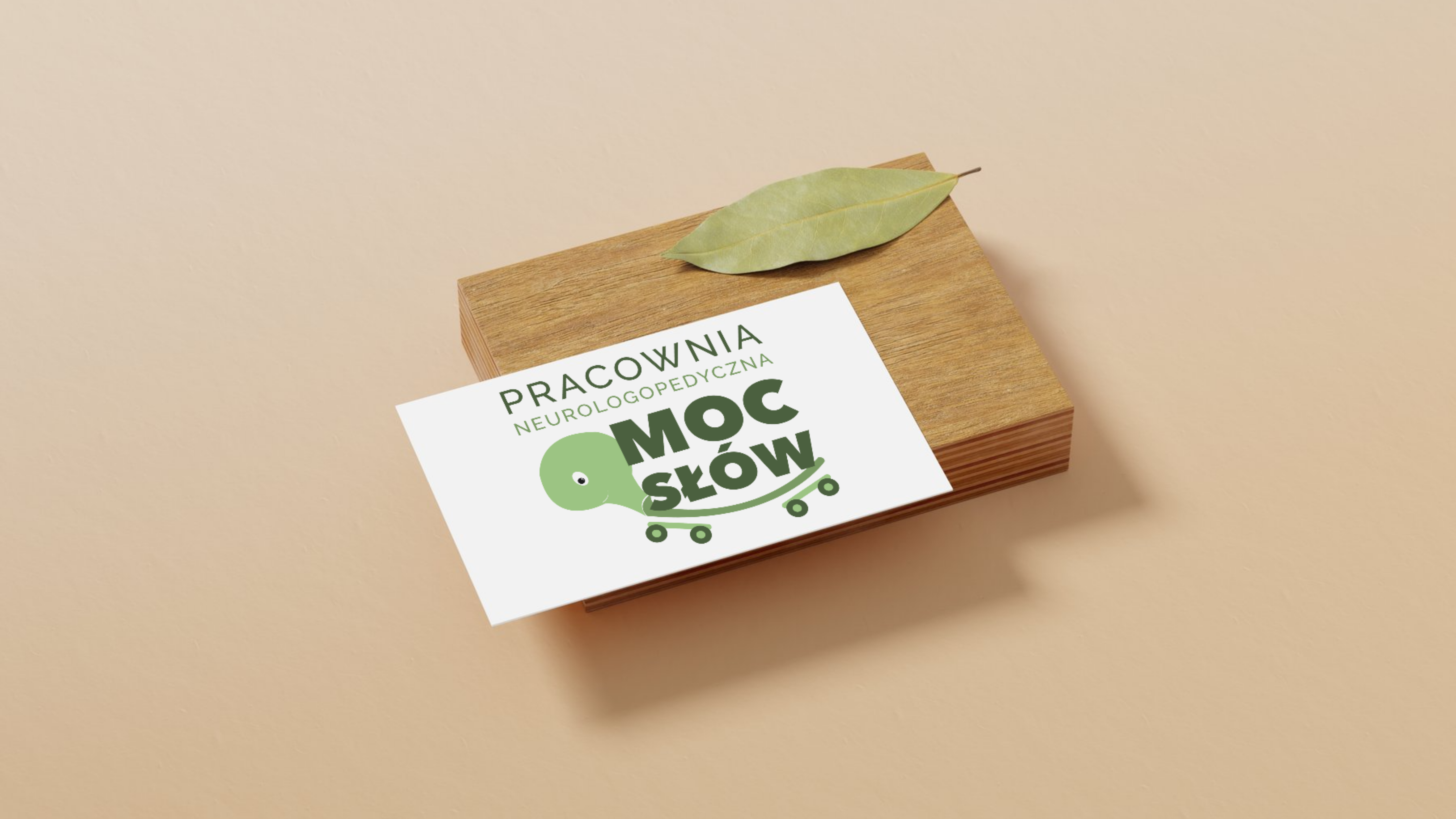
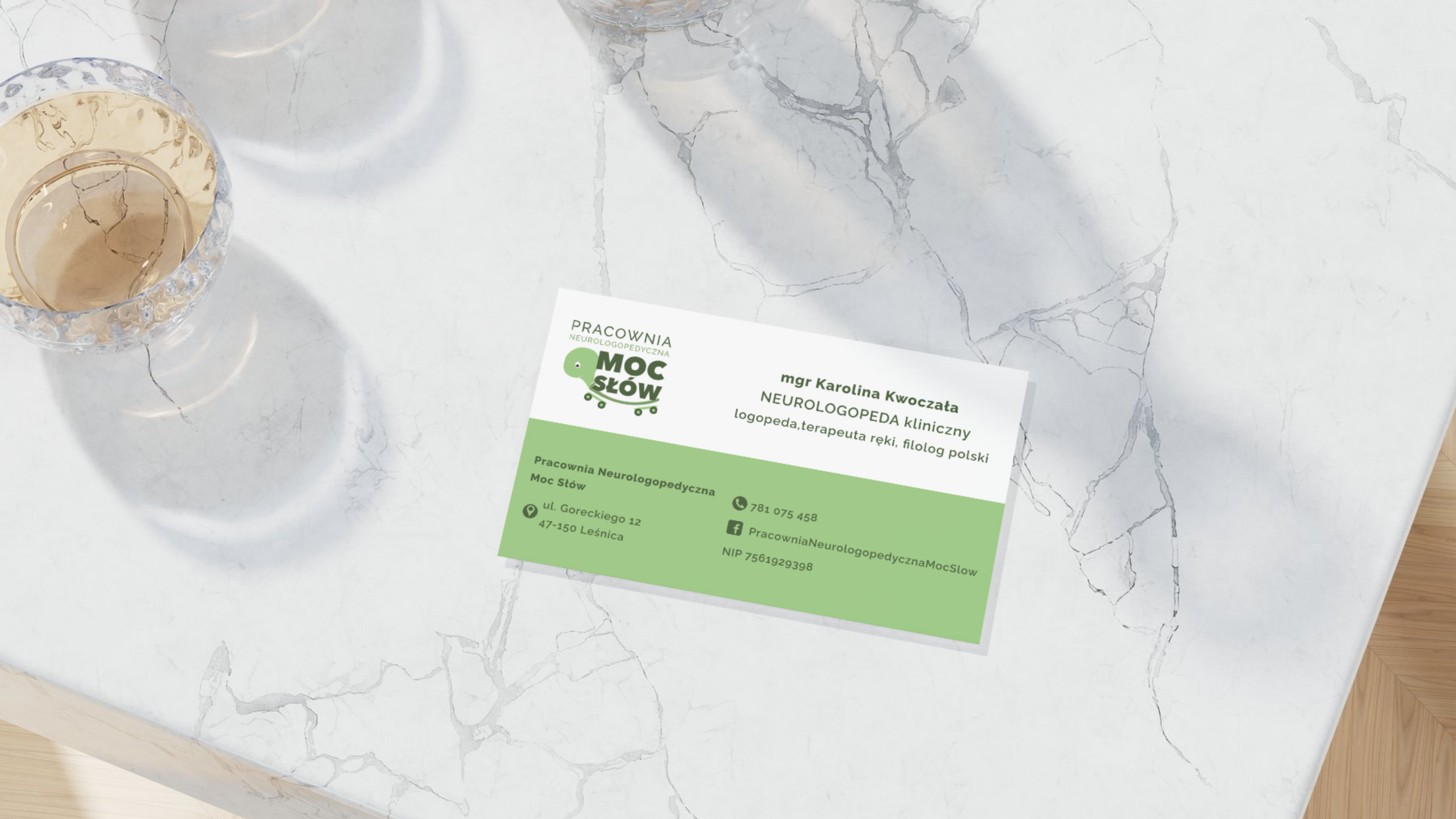
This project was created for the Neurological Speech Therapy Office 'Moc Słów'. As part of the visual identity, I designed a logo, business cards, letterhead, and other brand materials.
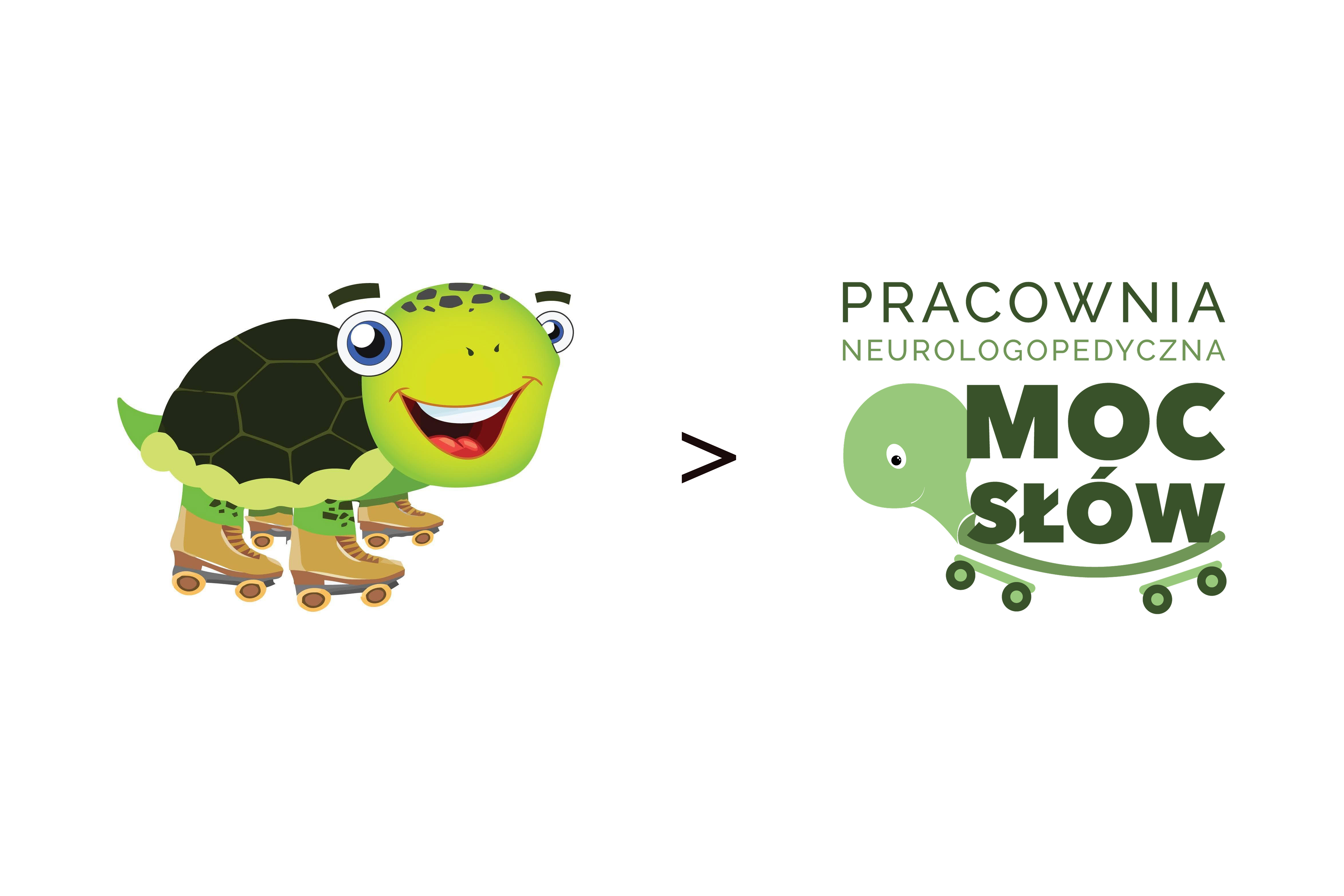
The project is a rebranding of the Office. The old version had too many details and was hard to use in digital and print materials. The new version refers to the previous one but has a simpler, more modern look.
BACKGROUND
The Neurological Speech Therapy Office 'Moc Słów' deals with speech therapy and cognitive processes. The therapy primarily covers young children, but also adults.
A turtle on roller skates was the main element of the previous logo. To ensure brand recognition, I decided to keep the turtle in the new version, but in a modern and simpler way. Because the Office works mainly with children, the logo has a friendly look and gentle colors.
The new logo comprises a symbol and a logotype. Regarding typography, I selected AvenirNextCyr in Heavy weight for the brand name 'MOC SŁÓW' and Raleway for the descriptor 'PRACOWNIA NEUROLOGOPEDYCZNA'. The use of these geometric sans-serif typefaces ensures the design looks fresh, contemporary, and professional.
To ensure the logo's responsiveness across various formats, I created both vertical and horizontal versions.
I created three color versions of the logo: black, dark blue, and bright blue on a dark blue background.